In last week’s post, we detailed some of the ways political campaigns use GIS and spatial information to bolster their efforts. Just as contenders in those contests benefit from diverse data, so too can parties responsible for organizing and running those elections. The goal? To make voting freer, fairer, and more accessible.
In much the same way geo-tagging voters helps campaigns identify areas and addresses to target, the people who organize can use spatial data to communicate information, place voters in correct districts, and set up enough polling places to satisfy voter demand (thereby avoiding long lines at the polls). In 2019, NSGIC released a guide for GIS-enabled elections, which they made available here. The document outlines five best practices, which consist of hiring a team of specialists, creating and maintaining a voting unit GIS layer, developing a statewide geocoding strategy, assembling a contextual GIS layer, and implementing a data validation process.
Those practices are aimed at increasing voter turnout, making participation easier, and clarifying who should be voting where. At times, however, those goals seem at odds with existing districting systems.
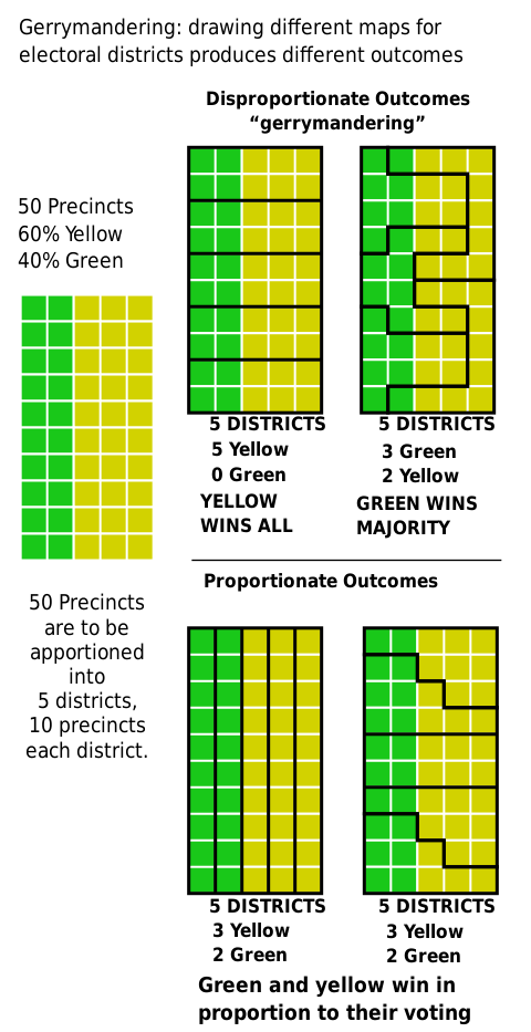
In the US (though the issue persists in other representative democracies), “gerrymandered” districts are something most voters can agree are unfair. Gerrymandering is the practice of manipulating district boundaries to tip the balance in favor of one party or another. In the US, efforts to stymie gerrymandering have been met with resistance from law makers, despite the practice’s unpopularity. The result is an electoral map filled with shapes only an incumbent could love.
Diagram courtesy of M. Boli, CC BY 4.0
Luckily, spatial data has no political affiliations or aspirations, and leveraging its objectivity is a way to increase the fairness and accessibility of elections in systems like that in the US. And with 2020 census data on the horizon, a new way forward is possible.
As detailed in this article from GIS Lounge, there are specific indicators that point to an un-tenably gerrymandered district. Voting history and district’s boundaries are compared against data like demographic breakdowns, landscape features, income averages, metrics of shape, and other local factors.
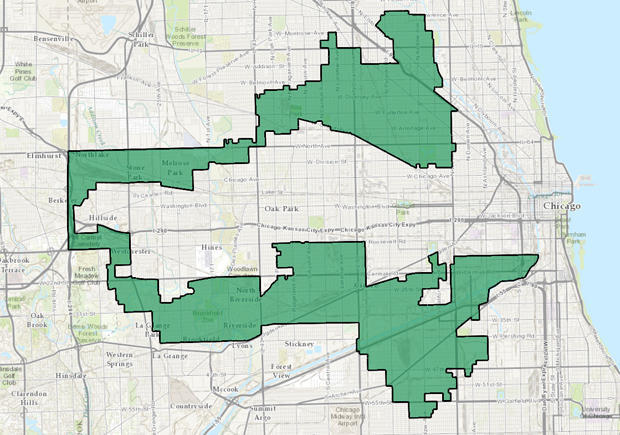
A gerrymandered district in Illinois. Image courtesy of CBS News.
This study by Kamyoung Kim of Kyungpook National University’s Department of Geography Education details a specific approach for optimizing spatial data to detect biased districts, called the capacitated double p-median problem with preference (CDPMP-P) approach. This approach analyzes a district’s spatial data, population relative to representation, and whether or not the voting infrastructure is robust. If the area scores high, it is likely not gerrymandered. A low score, however, means that district may need a democratic overhaul.
With these tools, election officials and organizers can help shepherd electorates around the world into a fairer democratic future.