Whether due to honest mistakes, purposeful deceptions, or the inertia of progression, inaccurate maps have consequences.
In previous posts, we have detailed how maps and geospatial data shape the very fabric of reality around us, and we’ve also chronicled the advances in accuracy through the ages. But what happens when maps, or their users, are slow to catch up with the times? Early mapping was far from accurate, and parts, we now know, were based on superstition. In other cases, they were based on deception.
“The Phantom Atlas,” by Edward Brooke-Hitching includes examples of purposeful mapping falsehoods.
In 1539, the Mexican island of Bermeja first appeared on Spanish maps. It continued to appear well into the 20th century. Starting in the 1980s, the Mexican government hoped to find it and secure oil rights on the island. Searches for the island persisted until 2009 when it was concluded the island did not exist.
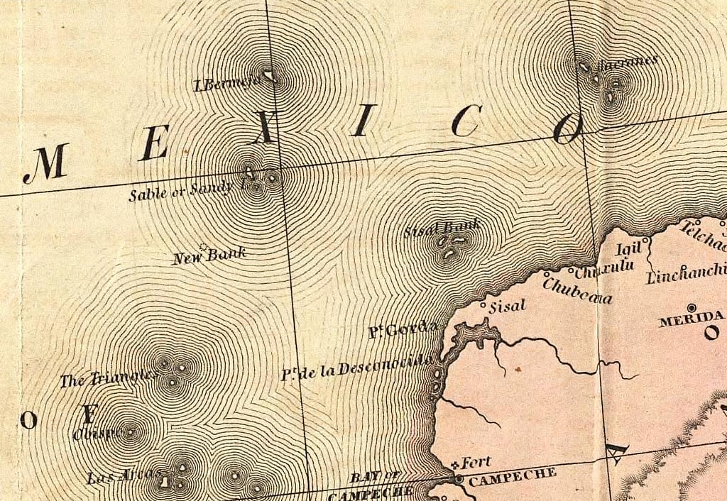
Bermeja as depicted on a Spanish map via the David Rumsey Map Collection.
Infamous deceivers like Benjamin Morrell, who ‘discovered’ islands like “New South Greenland” and “Morrell’s Land,” where only open water exists, took advantage of the public’s credulity. In 1822, Gregor MacGregor convinced 270 British colonists to sell their possessions and buy land from him in the newly-established South American country of ‘Poyais’. The problem was, MacGregor’s ‘Poyais’ land was nothing more than swampland; most of his settlers never made it back to Britain.
The trust people have in maps is significantly increased when children are the consumers. When a child sees a map of the world for the first time, it is presented as an absolute fact. In the case of older sea maps scattered with krakens and giants, children may grow up believing monsters roam the earth and seas. In the case of the standardization of the Mercator projection map, children grow up with distorted ideas about hemispheric proportions and global dynamics.
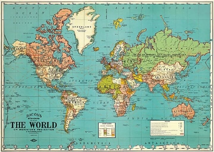
When Gerardus Mercator released his 1569 map, “A New and Enlarged Description of the Earth with Corrections for Use in Navigation,” he was not intending to introduce a standard visualization of the Earth. The map’s purpose was to allow straight lines to be drawn between ports and used as a practical tool by sailors, navigators, and travelers.
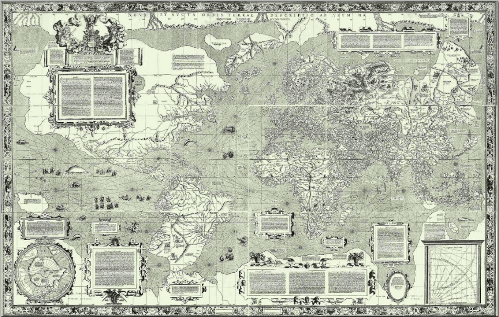
New and Enlarged Description of the Earth with Corrections for Use in Navigation Map via International Cartographic Association.
In the 19th and 20th century, as the number of mariners grew, so did the prevalence of Mercator projection maps. Anyone who has visited a Western classroom in the last half-century is familiar with this projection. The trouble is, its inaccuracies bolster attitudes of ethnocentrism, the belief in the inherent superiority of one’s own ethnic group or culture, and even unconsciously racist worldviews. The Mercator projection maps tend to emphasize European and Northern societies; in a typical version, the countries above the equator take up close to ⅔ of the page space, diminishing the importance of Southern continents and nations (whose populations are largely people of color). Jane Elliot has famously spoken about the distortion of the Mercator Projection and stated “This is not just ridiculous, it’s deliberate”. Greenland’s size in relation to South America is a good example here. In the age of colonialism, this presentation of European nations helped underscore their ideas of superiority over other nations.
Mercator Projection, via brilliantmaps.com.
As proof that the long term use of Mercator projection maps may have less to do with accuracy and more with biased attitudes: when the Soviets undertook their ambitious world mapping endeavor, they used the Pulkovo 1942 projection.
In recent years, educators and mapping companies have worked to rectify this situation. Companies like ODT Maps are working to correct the distortion caused by longtime use of Mercator maps by distributing maps like the one developed by Arno Peters in 1974 map, which aims to be fair to all people.
As ODT Maps founder Bob Abramms says in a lecture, “for a map to show the truth, it must make a visual lie of something else”. A globe sliced apart and laid flat, for example, is not easily decipherable to a layperson. The Mercator projection shows accurate lines of passage but distorts continent proportions. Today, digital geospatial technology allows users to parse data in three dimensions, meaning fewer of these trade-offs, but it’s import to keep historical misleading cartography in mind and ensure any distortions are clearly communicated and not presented as fact.